Calendar
App design
UI design
App to help you to stay organised. Recently recognised by DesignRush as one of The Best Calendar App Design.
Read more on design rush
Read more on design rush
Brief
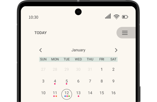
This calendar is an app designed with the user in mind, making it customisable to meet individual needs. The app's design is meant to be minimalistic and intuitive, ensuring that even first-time users can navigate it effortlessly.
overview
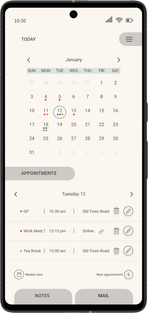
The calendar app I designed features a consistent design, allowing users to become familiar with it quickly. Buttons are placed alongside relevant text labels, making it easier for users in the learning process to use this application. The app offers a range of valuable functions, such as customisable notifications, event syncing with other calendars, and the ability to add new events or tasks easily.
Features
The design focuses on a diary element where you can schedule an editing appointment. You have monthly or weekly views with options to add a link to a Zoom (but not only) meeting. Also, you can manage notes and check your email. The app has a navigation menu where you can manage different calendars and the app settings. In addition, this calendar app could be synced with other productivity apps like Outlook and Trello to ensure that you’re on top of your tasks. Furthermore, the app provides a clean and simple task management tool that lets you add tasks effortlessly to your schedule.

typography
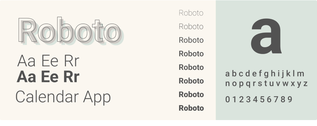
The typeface used in the app is a simple, clean sans-serif font that enhances readability and ensures that users can quickly locate the information they need. Roboto was chosen for its simplicity and excellent legibility in small sizes. In addition, its modern and clean appetence complements the minimalistic design of the app.
palette
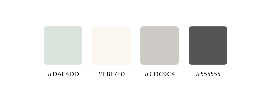
The app features a modern colour palette, consisting of shades of pale ivory, pastel grey and green for a calm and soothing user experience. The look and feel of the app are meant to be calming and encourage focus, making it easier for users to manage their schedules and tasks effectively.
Check Other Projects
Would you like to work together?
Contact me
