sherene rutherford
Website redesign
UX design • UI design
Responsive Website
Responsive Website
Website design to promote and sell Sherene Rutherford books and keep her followers informed about upcoming events.

Brief
Sherene Rutherford is a British author that was seeking to redesign her website to better showcase her work and increase engagement with her readers. I was fortunate to design a landing page to help to promote her new book and achieve her goals.
overview
Sherenerutherford.com is the website of a British author with Jamaican heritage. This site aims to promote and sell her books and keep her followers informed about upcoming events. She wanted a design that captures the essence of her brand, highlights her new work, and engages her readers.
The author’s website lacked an effective user interface and user experience, which ultimately resulted in lower traffic and sales. The website's outdated design also made it difficult for users to navigate and find the information they were looking for, which negatively impacted the author's online presence and sales.
The author’s website lacked an effective user interface and user experience, which ultimately resulted in lower traffic and sales. The website's outdated design also made it difficult for users to navigate and find the information they were looking for, which negatively impacted the author's online presence and sales.
Exploring
The process of exploring involved a deep dive into the author’s brand and target audience to identify key design features that would resonate with them. A strategy was developed to enhance the user experience by creating an intuitive and understandable navigation. The scope of the project included redesigning the landing page to feature a more modern and visually appealing design, improving navigability through restructuring the website's menu. After brainstorming different designs and identifying the users’ needs, I iterated through different layouts until I found the most suitable one for this project.


wireframing
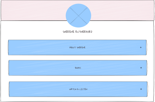
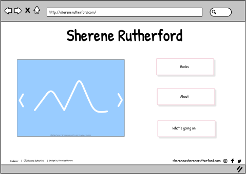
Different ideas and layouts were tested to determine the most effective way to present the website's content and features. Developing lo-fi wireframes helped me to share design ideas and features with my client in the early stage of the project to ensure that user path, page layouts, and information hierarchy were clear.
landing

book

mockups
All testing results and wireframing were used to implement the changes to the website's infrastructure and design. The Hi-fi mockups helped to make sure the website meets the user's needs and is efficient and effective. I also used them to understand possible usability issues after testing the prototype with a group of users.


visuals
The look and feel of the redesign focused on creating a modern and professional to align with the author's brand and target audience.
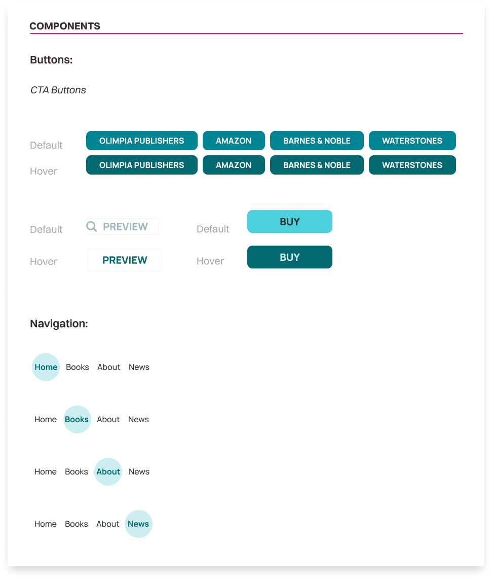
I have been working with Sherene to design her style brand since she published her first work. Her books and stories are set in the Caribbean, so she wanted a peaceful and paradisiac feeling on her website as well as a friendly approach to the user. To convey these parameters I created a design with plenty of white space and I used a geometric, elegant and readable typeface for the brand and a minimal neo-grotesque sans-serif for the content. In addition, I used a monochromatic scheme with a beach and nature inspiration. Overall, the design is clean, sophisticated and welcoming to users, which helps to create a positive experience for her audience.
I have been working with Sherene to design her style brand since she published her first work. Her books and stories are set in the Caribbean, so she wanted a peaceful and paradisiac feeling on her website as well as a friendly approach to the user. To convey these parameters I created a design with plenty of white space and I used a geometric, elegant and readable typeface for the brand and a minimal neo-grotesque sans-serif for the content. In addition, I used a monochromatic scheme with a beach and nature inspiration. Overall, the design is clean, sophisticated and welcoming to users, which helps to create a positive experience for her audience.

responsiveness
Lastly, the redesign was made fully responsive across devices, ensuring that users have a smooth and seamless experience no matter what device they are using.

testing
The final step in the redesign process was to conduct a round of testing with users to ensure that the new design was effective and efficient. So I used a prototype to gather feedback and identify any potential usability issues.
Check Other Projects
Would you like to work together?
Contact me


